Final Fantasy XV - General News Thread

Members see less ads - sign up now for free and join the community!

LeonBlade

Administrator
Administrator
Moderator
Site Staff
Oct 25, 2013
2,026
1,864
33
Blossvale, New York
It should be really cool! I'll admit though that I was hoping the ATR would come first... Oh well. Think they'll just show fire magic? I'm dying to see blizzard and thunder in action, as well as this royal magic Tabata's been talking about recently.
They have deliberately only shown Fire magic any time they've shown magic, so I wouldn't be surprised if that's all they show for a while.
 
Likes: Death Penalty

Tornak

Keyblade Master
May 18, 2014
718
421
31
Madrid, Spain
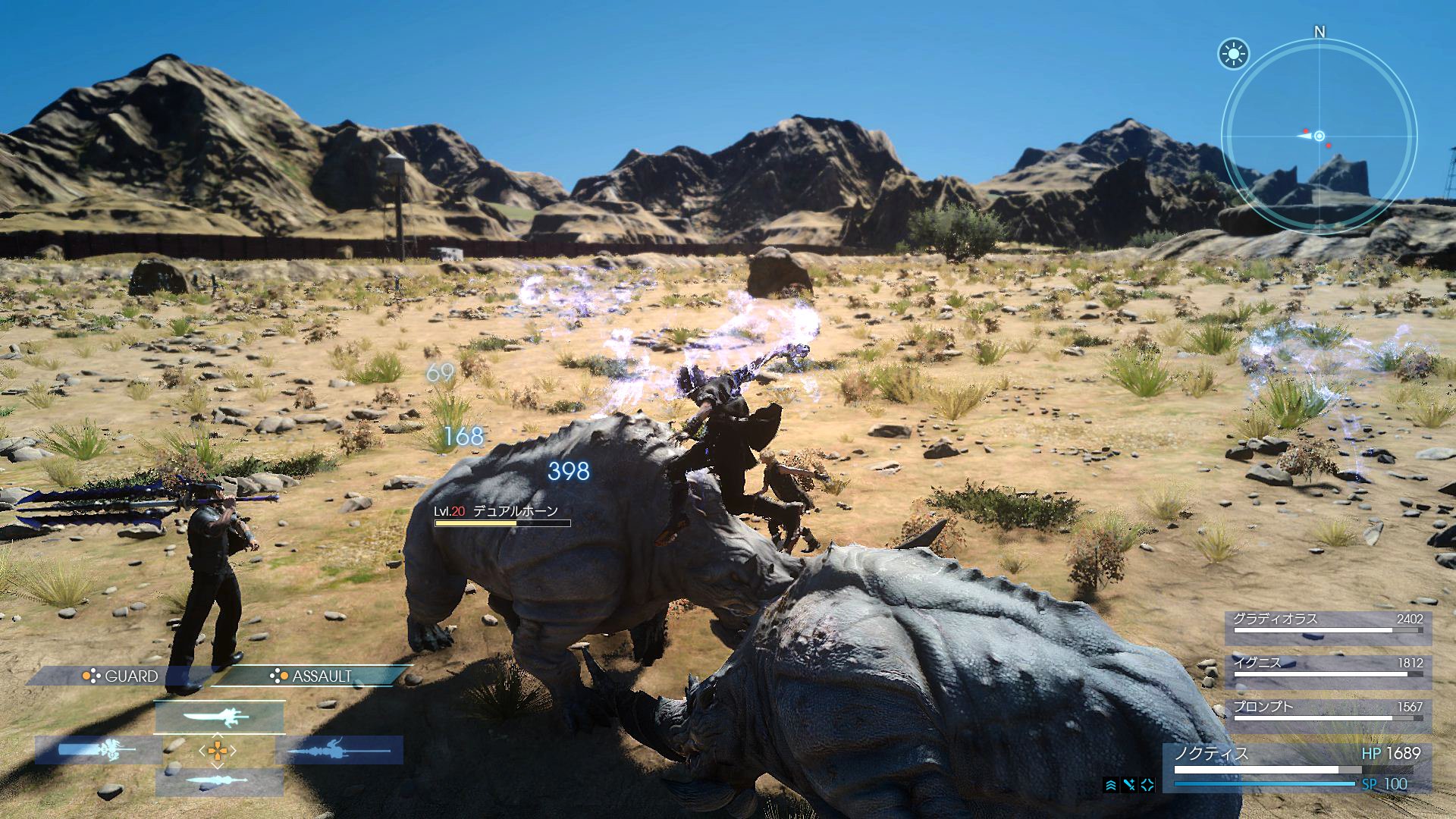
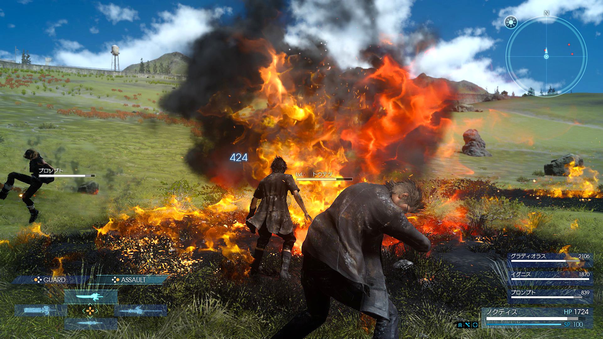
The only thing I don't like about those pics is the grass: it's tragic how it drastically dissapears so near the characters. Although I prefer having that kind of game if it runs steadily (and they should have more than 6 months (at the very, very least) to polish everything).

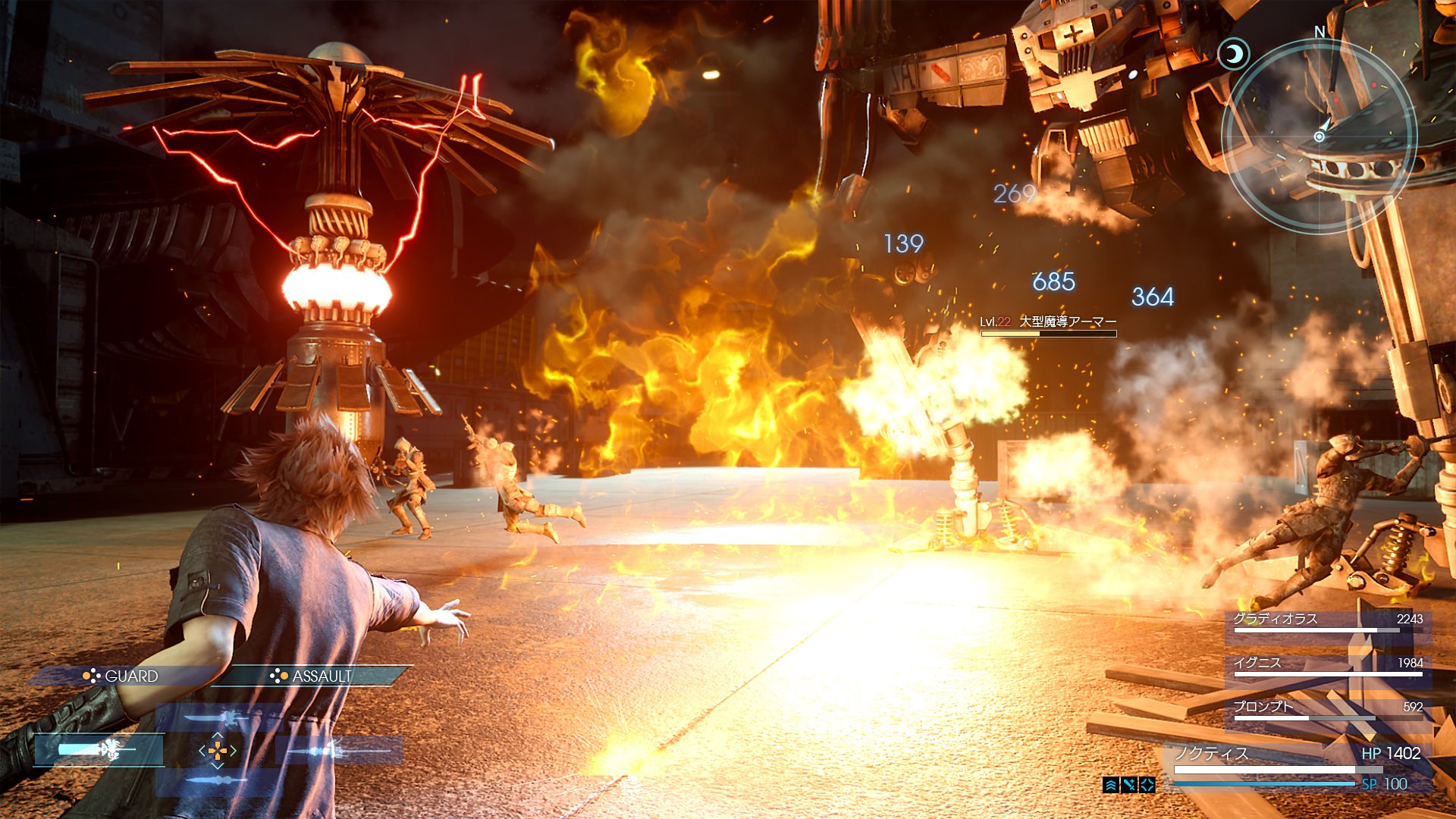
Apart from that, I'm loving the visuals. The character models continue being insane, the lighting seems much more colourful and lively than the one in ED (thank god) and those particle effects are amazing. The screen with Noctis casting Fire at night is great.

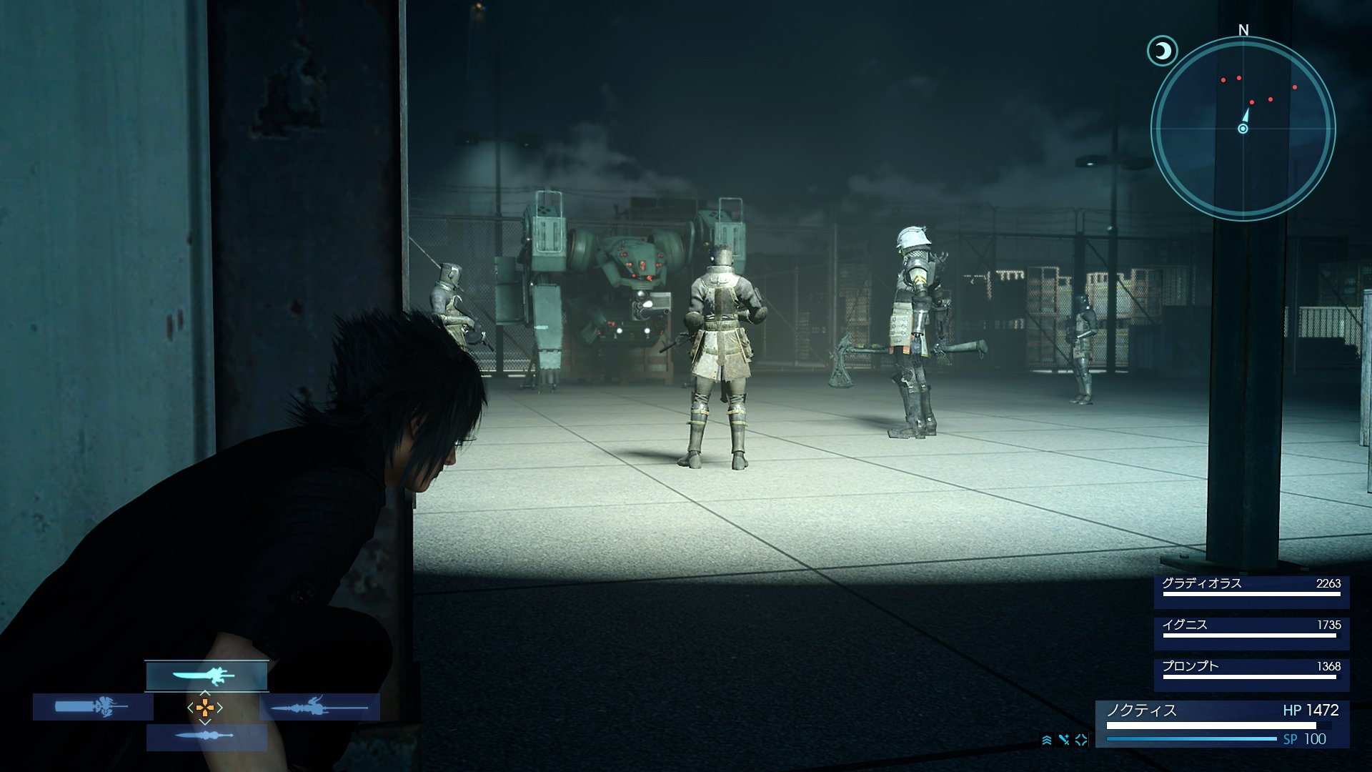
Regarding gameplay, I'm very interested in seeing how magic actually works, as well as seeing the stealth sections (hopefully they're better than the previous ones we've had in this series) and how the aerial combat works now. I want the combat to be as tight, responsive and fast as possible. And hopefully what LeonBlade said about the "guard" thing is true, because I'm definitely loving seeing that layout there and what it could imply :p

Ah, and that desert area looks cool (deserts being places with little to no grass helps lol). And is the prairie one set in Duscae or a nearby place? It doesn't necessarily have to be, though.
 

LeonBlade

Administrator
Administrator
Moderator
Site Staff
Oct 25, 2013
2,026
1,864
33
Blossvale, New York
The only thing I don't like about those pics is the grass: it's tragic how it drastically dissapears so near the characters. Although I prefer having that kind of game if it runs steadily (and they should have more than 6 months (at the very, very least) to polish everything).
Yeah, it's definitely really bad looking in two of the screen shots, but it might be different platforms? I know we got bad screenshots for Duscae as well and it didn't look anything like those in the release (although Duscae had its own problems).

I imagine they haven't partnered with Avalanche Studios yet for their work with streaming open environments given that it looks the same from what we've seen for a while. The game can definitely perform better than this, but it might just be on Xbox One or just some other problem.

Also, for the desert looking area the Tweet says "Noctis shows off his aerial blade work. Each weapon type has a host of unique actions, combos & magic attacks". We've known about the abilities and different passive actions, but they also mention here magic attacks. I wonder exactly how all of this will pan out in the final game.

With magic attacks, it kind of reminds me of classic weapons like Fire Swords where you attack with elemental damage only with a modern twist where it plays more into a real time realistic magic system.

We will have to see, excited to see the game in motion in just 5 days!
 
Sep 26, 2013
383
288
35
Also, for the desert looking area the Tweet says "Noctis shows off his aerial blade work. Each weapon type has a host of unique actions, combos & magic attacks". We've known about the abilities and different passive actions, but they also mention here magic attacks. I wonder exactly how all of this will pan out in the final game.

With magic attacks, it kind of reminds me of classic weapons like Fire Swords where you attack with elemental damage only with a modern twist where it plays more into a real time realistic magic system.

We will have to see, excited to see the game in motion in just 5 days!
Very astute, I took special notice of this as well! I know that way way back in the day, Noctis cast his magic through his weapons. This is a relic that even appeared in the re-reveal of Final Fantasy XV back in 2013! At that time I unfortunately wasn't a part of these forums, but I speculated that magical spells could to an extent be either a product of or equipped to certain weapons. If that's still the case, I would be absolutely thrilled. Maybe this is the royal magic Tabata references?
 
Likes: Tornak

Tornak

Keyblade Master
May 18, 2014
718
421
31
Madrid, Spain
Yeah, the magic thing looks interesting, especially given that there are two kinds. But wasn't magic (one type, at least) casted through some rings you can equip? The weapon related one might be the special kind Noctis has.

And I forgot, but the new HUD looks lovely. The best is still the E3 2013 one, but this is actually a very similar one, while still having some of your classical FF blue, which is always nice.

Yeah, it's definitely really bad looking in two of the screen shots, but it might be different platforms? I know we got bad screenshots for Duscae as well and it didn't look anything like those in the release (although Duscae had its own problems).

I imagine they haven't partnered with Avalanche Studios yet for their work with streaming open environments given that it looks the same from what we've seen for a while. The game can definitely perform better than this, but it might just be on Xbox One or just some other problem.
Oh, yeah, didn't think about that. I mean, even if they don't manage to make airships controllable, they should be able to help alleviate these problems, so hopefully they're looking into that already, which I guess they might since this year seems mainly a polishing period.
 
Likes: Death Penalty

Noctis_Caelum

Chocobo Knight
Jul 15, 2014
214
285
Overall I like these screens, but I'm a bit suprising that the enviroment looks again strange like the chocobo screen from TGS.

Also the UI looks to me boring and too simple, just a "block".
My favorite was the E3 UI, it had this cool glass effect and the HP bar was white and red instead of white and grey like now. So you don't instandly know how much HP you have left.
The enemies health bar looks good, not too big like in ED.
All in all the UI need that certain something.

The fire looks really great and that smoke is just so realitic, also the game itself is more colourful now. :)
 
Likes: LeonBlade

Lulcielid

Warrior of Light
Oct 9, 2014
3,826
2,826
29
Argentina
Also the UI looks to me boring and too simple, just a "block".
My favorite was the E3 UI, it had this cool glass effect and the HP bar was white and red instead of white and grey like now. So you don't instandly know how much HP you have left.
The enemies health bar looks good, not too big like in ED.
All in all the UI need that certain something.
I personally love the new UI, Minimalist, Translucent, extremely easy to read/understand, doesn´t hurt your clarity.
 
Likes: LeonBlade
Sep 26, 2013
383
288
35
Can't help but notice that assault is always highlighted when Noctis is casting a spell. If we're going off of Leonblade's earlier theory that guard and attack function differently now thanks to the new button placement- a theory I like- then does this mean that spellcasting may execute similarly to attacking with a weapon? It seems to indicate Noctis is pressing or holding down assault while unleashing magic. Could also be the two different battle modes or they may have even just moved guard off of L1 to make way for a Kingdom Hearts style magic quick menu. Guess we'll know soon. Man I can't wait to see it in motion!

I'm not too worried about the background stuff. The models look great, the effects look better than great. I have faith that the rest will fall into line.
 
Last edited:
Jun 7, 2014
898
625
Poland
The new UI looks fine, but I won't hide I liked the 2013 design much more (that slick glass effect). The biggest issue I have with this one is the color, which I find a bit too bright. I think both the grey from 2013 and dark blue from ED fit the game better. I'd also remove the blue rectangles around the weapon icons and leave just the icons like in 2013 UI. They seem unnecessary and are just clogging up the space.

I also noticed that they changed Noctis' MP to SP. It makes more sense now since these points aren't used for magic.
 
Likes: Noctis_Caelum

LeonBlade

Administrator
Administrator
Moderator
Site Staff
Oct 25, 2013
2,026
1,864
33
Blossvale, New York
Can't help but notice that assault is always highlighted when Noctis is casting a spell. If we're going off of Leonblade's earlier theory that guard and attack function differently now thanks to the new button placement- a theory I like- then does this mean that spellcasting may execute similarly to attacking with a weapon? It seems to indicate Noctis is pressing or holding down assault while unleashing magic. Could also be the two different battle modes or they may have even just moved guard off of L1 to make way for a Kingdom Hearts style magic quick menu. Guess we'll know soon. Man I can't wait to see it in motion!

I'm not too worried about the background stuff. The models look great, the effects look better than great. I have faith that the rest will fall into line.
Well, Assault is highlighted when he's doing the aerial attack as well, so I'm not sure how it will tie in with magic exactly, it's one of those things where we don't really have a lot of information. I don't believe he's actually holding it down though, but perhaps he might be like how comboing can also be activated by holding the assault button down.

Perhaps L1 functions now as a Magic modifier which functions similarly to a shortcut menu from KH, but instead of being based on L1 and one of the face buttons, it would be L1 and a direction and the assault button. Think of how the direction works with combos in Duscae 2.0. A normal sword style weapon holding back while attacking does a back flip off the enemy, you can also side step with left and right, etc. Imagine if you can bind abilities to the directional button on the magic button and cast them with the assault button. Rapid fire for short bursts for the spell, or holding the button down could channel a bigger spell.

The problem I have with this approach would be that you couldn't move and cast at the same time, so perhaps instead of the directional input altering the magic spell, you would hold down L1 and the weapon switcher will change to spell switcher, and now while holding L1 and using assault you can cast spells and similarly hold the assault button down to cast a bigger spell. Then, to change spells you would use the d-pad instead of directional input and you can just move freely.

Of course, we so no reference to that in the UI... so honestly I have no clue.
 
Likes: Death Penalty
Sep 26, 2013
383
288
35
Well, Assault is highlighted when he's doing the aerial attack as well, so I'm not sure how it will tie in with magic exactly, it's one of those things where we don't really have a lot of information. I don't believe he's actually holding it down though, but perhaps he might be like how comboing can also be activated by holding the assault button down.

Perhaps L1 functions now as a Magic modifier which functions similarly to a shortcut menu from KH, but instead of being based on L1 and one of the face buttons, it would be L1 and a direction and the assault button. Think of how the direction works with combos in Duscae 2.0. A normal sword style weapon holding back while attacking does a back flip off the enemy, you can also side step with left and right, etc. Imagine if you can bind abilities to the directional button on the magic button and cast them with the assault button. Rapid fire for short bursts for the spell, or holding the button down could channel a bigger spell.

The problem I have with this approach would be that you couldn't move and cast at the same time, so perhaps instead of the directional input altering the magic spell, you would hold down L1 and the weapon switcher will change to spell switcher, and now while holding L1 and using assault you can cast spells and similarly hold the assault button down to cast a bigger spell. Then, to change spells you would use the d-pad instead of directional input and you can just move freely.

Of course, we so no reference to that in the UI... so honestly I have no clue.
All I can say to this analysis is god yes. That would be some best-case scenario stuff and exactly how I'd like to see them pull this off. They've kept magic under wraps for so long that I'm hoping the system is something spectacular like that! Your directional idea is pretty cool, especially considering we've seen fire work in a sort of brushing motion in the past. Your analysis would not only allow for environment and element to be tactical choices, but what shape and quickness you choose for your spell to take. Yes please!
 
Likes: LeonBlade

LeonBlade

Administrator
Administrator
Moderator
Site Staff
Oct 25, 2013
2,026
1,864
33
Blossvale, New York
All I can say to this analysis is god yes. That would be some best-case scenario stuff and exactly how I'd like to see them pull this off. They've kept magic under wraps for so long that I'm hoping the system is something spectacular like that! Your directional idea is pretty cool, especially considering we've seen fire work in a sort of brushing motion in the past. Your analysis would not only allow for environment and element to be tactical choices, but what shape and quickness you choose for your spell to take. Yes please!
Haha, well after all it's just my mind wandering around for these ideas, I expect honestly it won't be anything like this, hopefully it will be better but we'll just have to see. One thing I hope from my idea is actually in the game is the ability to control the spells in the form of charging similar to Type-0 I guess but more along the lines of how I described it where you just hold the cast for longer to get a bigger spell. This reduces the need to have multiple tiered spells for the sake of more damage with a new name (KH even just overrides the old spells) and makes it feel like you are putting power into the spells over just pressing a button. Quick casts of Fire can be delivered in short bursts providing for great range attack that won't spread but a long cast time charged up could mean big bursts of damage and in an ideal environment spread to the surroundings and cause massive damage.

Of course, we don't know how the resource for magic even works, so again it's something where we have to wait and see, I could think of a thousand ideas and it doesn't matter without all the information.

I always love brainstorming though!
 
Likes: Death Penalty