Was about to post it haha. It looks like it might have some very interesting info!
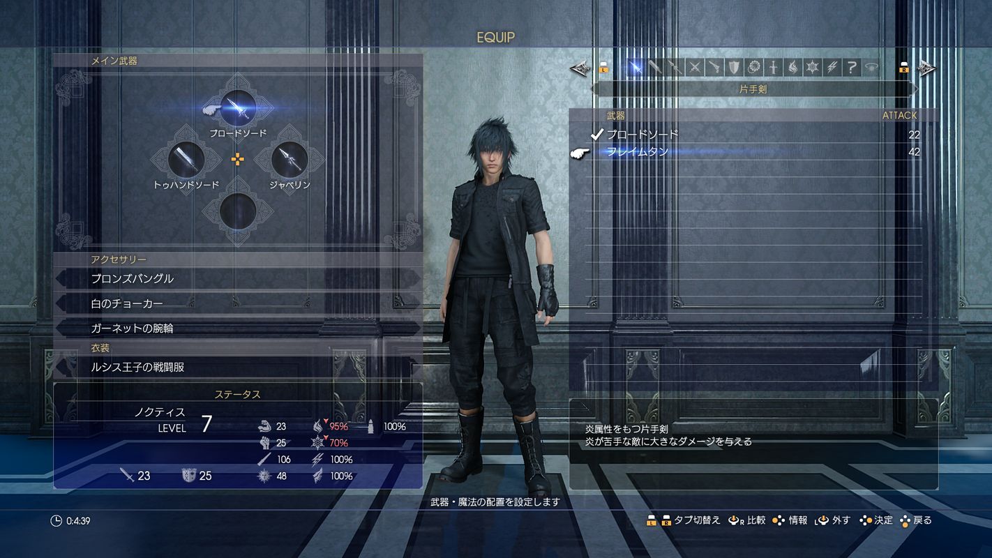
We can see some updates in the menu: it'll probably look like this (or similar enough) in the final build. I really like the room they're in and the icons: everything looks dense enough, but not too messy or convulted. Pretty elegant, actually, as it makes you instantly think of Lucis' architecture and iconography (or, more accurately, Lucis monarchy's) and kinda makes me think of a battle room inside the castle in which they train/prepare for battle.
Also, they've updated the weapon icons:
We see all the elemental spells there. Also, I wonder what the "?" stands for. And we see the ring there (greyed, so I assume that, in this picture, Noctis can't use its power for whatever plot reason or, most likely, still hasn't acquire it).
Oh, and those diamonds in which the weapons are inside are interesting. Wonder whether the weapon deck will look like that during battles.
PS: it's silly and this is definitely not the only game that does it, but I've always loved being able to see the weapon models in the menu. Really like the design of the sword on the left (so far, I love the smaller/more realistic weapons, they look very ornamental and fit Lucis theme).


