Final Fantasy XV - General News Thread
- Thread starter LeonBlade
- Start date
Members see less ads - sign up now for free and join the community!
"So someone leaked these FFXV concept-arts. The one on the left is from Gamescom 2015 and the other two are new. "
https://twitter.com/RedMakuzawa/status/675244448226385921

Looks like Luna in the midst of the party in the new ones :> She's with them in their car goofing around with Noct on the right one.
https://twitter.com/RedMakuzawa/status/675244448226385921

Looks like Luna in the midst of the party in the new ones :> She's with them in their car goofing around with Noct on the right one.
Likes:
Noctis_Caelum and Tornak
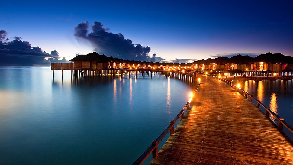
Killika...New location for FFXV. Upon a closer look, new UI, Minimap & all 4 party member now have MP bar.


That location looks gorgeous: tropical-ish locations are some of my favourite (after snowy ones, that is). Man, I'm pretty excited about the XV world. Hopefully it's as varied as a FF world should be. Also, I hope they make it look a huge, rich one (the only one where you can actually tell it's more than a few small towns is XII, even if you only go to a "few" places).
"So someone leaked these FFXV concept-arts. The one on the left is from Gamescom 2015 and the other two are new. "
https://twitter.com/RedMakuzawa/status/675244448226385921

Looks like Luna in the midst of the party in the new ones :> She's with them in their car goofing around with Noct on the right one.
https://twitter.com/RedMakuzawa/status/675244448226385921

Looks like Luna in the midst of the party in the new ones :> She's with them in their car goofing around with Noct on the right one.
Damn, you beat me to it! I like the new UI look.
That location looks gorgeous: tropical-ish locations are some of my favourite (after snowy ones, that is). Man, I'm pretty excited about the XV world. Hopefully it's as varied as a FF world should be. Also, I hope they make it look a huge, rich one (the only one where you can actually tell it's more than a few small towns is XII, even if you only go to a "few" places).
Yep, it seems like in the middle one is Prompto, Gladio, Regis, Noctis, Luna and Ignis. So I guess they all know each other since childhood.

Likes:
Noctis_Caelum
I think it's Cor, not Regis. I like how Cor is like the cool uncle or big brother to them since their childhood :> Can't wait to see more of him, he's already my fave character, especially after the first in-game footage of him in the last Dev Progress video.


And yes, he's, by far, the one I'm most interested in out of all the characters they've shown.
Hell, his is one of my favourite designs of the ENTIRE series and his background sounds very cool. That's why I was (still am) so dissapointed about not being able to control other characters. The main reason, actually
Likes:
Koozek
Found a bit bit higher resolution.
View attachment 322
So a minimap and new UI with longer bars, each character has it's own MP one.
But what are the 3 circles right next it?
Anyway, I love the water reflections and lightning.^^
View attachment 322
So a minimap and new UI with longer bars, each character has it's own MP one.
But what are the 3 circles right next it?
Anyway, I love the water reflections and lightning.^^
Likes:
Noctis_Caelum
I'm_pretty_sure_those_are_Probably_where_status_effects_go
Likes:
Prince Naphtali
Sorry_for_writing_like_this_my_spacebar_isn't_working_right_now.
Likes:
Prince Naphtali
It looks like there is a small bar to the right of MP or at the very least a break in the bar for some reason. Is that supposed to do with the Guard to not feed into your MP? Everyone has one though, so I'm not sure, it also looks a different color than the MP bar.
As for those 3 circles, I don't think it's just 3 circles, why is there space to the left of the circles with what looks like half circles and something white. I don't think it's text, so could it be something filling these circles? If it is text, then Noctis and Gladio both have the same text for theirs while Ignis and Prompto have the same text for theirs.
I think these slots are for something else.
Likes:
Noctis_Caelum
Final Fantasy XV Pre-Beta Already Running on PC and PS4; Dev Talks About Memory Constaints.
http://www.dualshockers.com/2015/12...pc-and-ps4-dev-talks-about-memory-constaints/
http://www.dualshockers.com/2015/12...pc-and-ps4-dev-talks-about-memory-constaints/
Likes:
Noctis_Caelum and LeonBlade
It looks like there is a small bar to the right of MP or at the very least a break in the bar for some reason. Is that supposed to do with the Guard to not feed into your MP? Everyone has one though, so I'm not sure, it also looks a different color than the MP bar.
As for those 3 circles, I don't think it's just 3 circles, why is there space to the left of the circles with what looks like half circles and something white. I don't think it's text, so could it be something filling these circles? If it is text, then Noctis and Gladio both have the same text for theirs while Ignis and Prompto have the same text for theirs.
I think these slots are for something else.
As for those 3 circles, I don't think it's just 3 circles, why is there space to the left of the circles with what looks like half circles and something white. I don't think it's text, so could it be something filling these circles? If it is text, then Noctis and Gladio both have the same text for theirs while Ignis and Prompto have the same text for theirs.
I think these slots are for something else.
Going off of Episode Duscae's UI, that is text and it's probably their current HP totals. On the plus side, in Episode Duscae statuses went to the left of the character bars and not to the right so I agree with you that the slots are probably something else.


