Final Fantasy XVI - General News Thread
- Thread starter Skye
- Start date
Members see less ads - sign up now for free and join the community!
-
This site uses cookies. By continuing to use this site, you are agreeing to our use of cookies. Learn more.
So I don't really want to get into this petty bullshit back and forth about the visual fidelity when the game is at least two years out but ...
If I was them I would be sacrificing the visual fidelity in order to hit a certain 60fps. If they're actually serious this time about making an actual good action game that doesn't feel god awful to control then this is absolutely required.
If I was them I would be sacrificing the visual fidelity in order to hit a certain 60fps. If they're actually serious this time about making an actual good action game that doesn't feel god awful to control then this is absolutely required.
Likes:
Nova and Lulcielid
This is Ryota Suzuki's twitter: https://twitter.com/suzuryo_0516
He only has two tweets and he retweeted the FFXVI announcement. He's 99% the battle director of FFXVI
He only has two tweets and he retweeted the FFXVI announcement. He's 99% the battle director of FFXVI
Likes:
Storm
Some thoughts on the trailer which might have been mentioned already.
Main character uses a lot of fire based attacks. Joshua and what I presume is his father; the royalty of this kingdom, both wear red clothing. I'm thinking we start off in the Fire Kingdom where Phoenix is the benevolent patron Eikon of the land.
The man made of fire we see is the soul / essence of the fire crystal. Joshua's despair summons it to appear and creates a new Eikon, Ifrit, which is far more aggressive. Ifrit then replaces Phoenix as the new patron Eikon, which may alter the state of the Fire Kingdom from a peaceful place to a war hungry nation.
I doubt the main character's sole goal is to destroy Ifrit and the Eikons. Somebody would have purposely put events into motion with the attack on the main character's home town, and this somebody or something is the true threat.
I'm also kinda hoping the main character doesn't have a name. We the player give him a name. Throughout the story he is only referred to as "Joshua's Shield" or "you, new guy".
Likes:
Cloud_CR and Storm
Some thoughts on the trailer which might have been mentioned already.
Main character uses a lot of fire based attacks. Joshua and what I presume is his father; the royalty of this kingdom, both wear red clothing. I'm thinking we start off in the Fire Kingdom where Phoenix is the benevolent patron Eikon of the land.
The man made of fire we see is the soul / essence of the fire crystal. Joshua's despair summons it to appear and creates a new Eikon, Ifrit, which is far more aggressive. Ifrit then replaces Phoenix as the new patron Eikon, which may alter the state of the Fire Kingdom from a peaceful place to a war hungry nation.
I doubt the main character's sole goal is to destroy Ifrit and the Eikons. Somebody would have purposely put events into motion with the attack on the main character's home town, and this somebody or something is the true threat.
I'm also kinda hoping the main character doesn't have a name. We the player give him a name. Throughout the story he is only referred to as "Joshua's Shield" or "you, new guy".
Main character uses a lot of fire based attacks. Joshua and what I presume is his father; the royalty of this kingdom, both wear red clothing. I'm thinking we start off in the Fire Kingdom where Phoenix is the benevolent patron Eikon of the land.
The man made of fire we see is the soul / essence of the fire crystal. Joshua's despair summons it to appear and creates a new Eikon, Ifrit, which is far more aggressive. Ifrit then replaces Phoenix as the new patron Eikon, which may alter the state of the Fire Kingdom from a peaceful place to a war hungry nation.
I doubt the main character's sole goal is to destroy Ifrit and the Eikons. Somebody would have purposely put events into motion with the attack on the main character's home town, and this somebody or something is the true threat.
I'm also kinda hoping the main character doesn't have a name. We the player give him a name. Throughout the story he is only referred to as "Joshua's Shield" or "you, new guy".
Likes:
Storm
I think FFXVI's biggest visual problem is FFXV, to be honest.
Case in point:
The primary point of comparison isn't "a really solid late PS4/XONE game." It's a predecessor that pulled off real-time scenes as absurdly over-the-top as the CG Final Fantasy used to be famous for.
The difference in base asset quality is pretty stark, too. Here's the most one-to-one comparison available -- closeups of Titan:
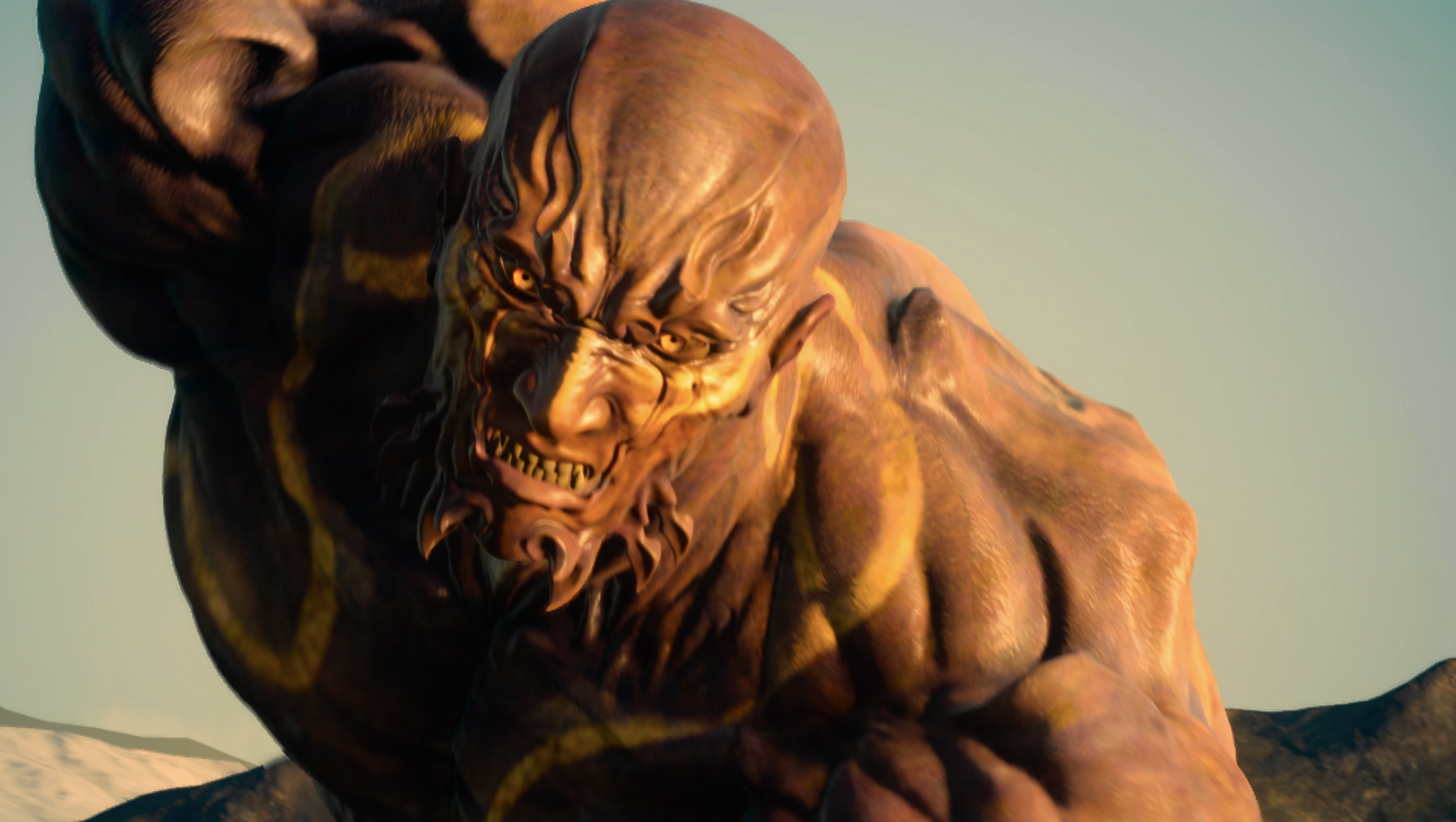
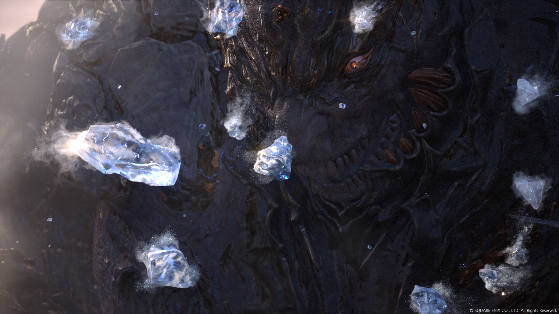
XV's looks like an impressive approximation of a Visual Works asset; XVI's doesn't.
And the existence of FFXV Windows Edition really doesn't help matters, because we've seen what well-made 4K textures look like, and it's quite possibly better than what we've seen in FFXVI:
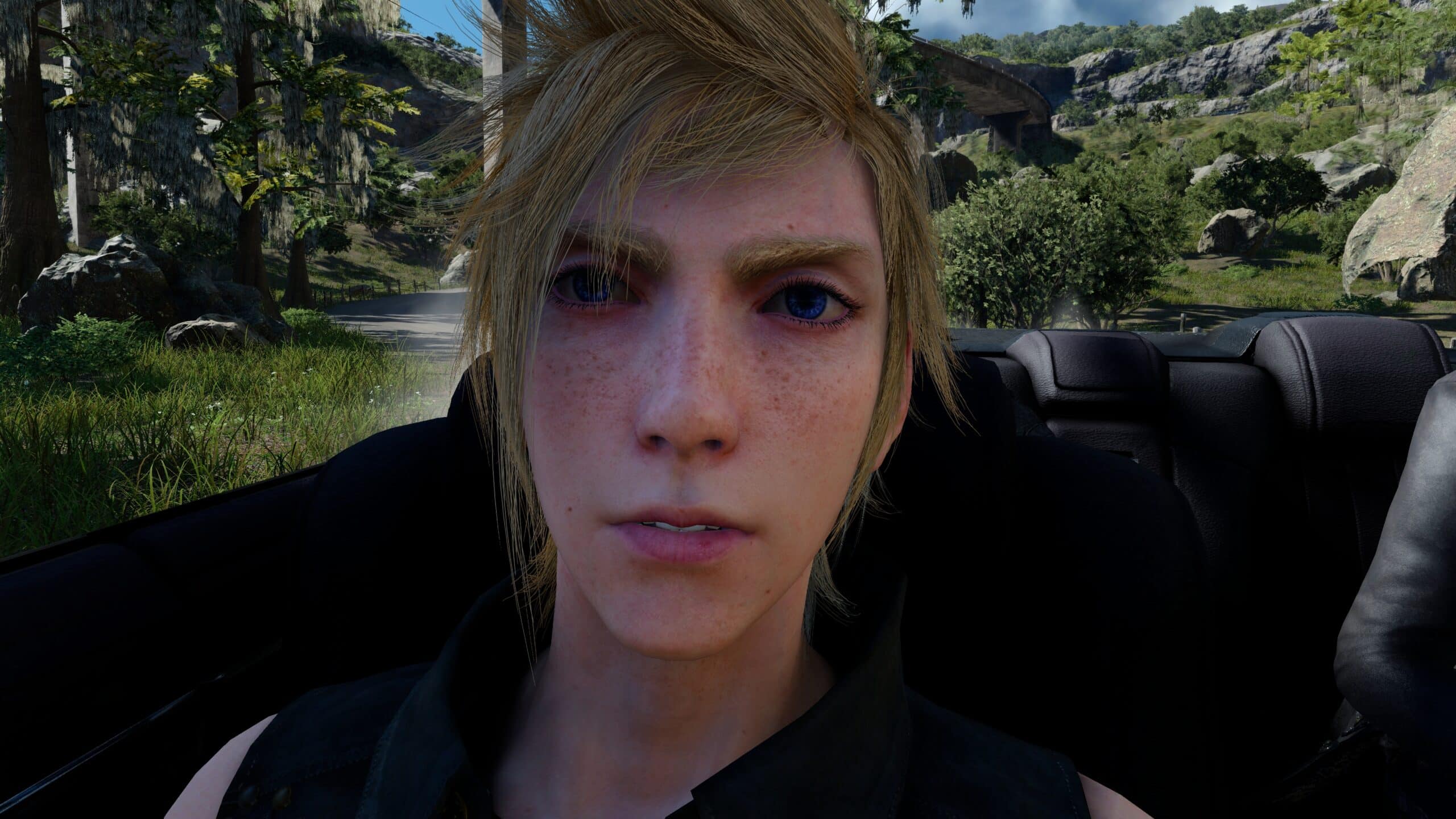

(It's also worth pointing out that the Prompto screen is of a LOD 0 gameplay model rather than a cutscene-specific model. IIRC, FFXV's LOD 0 gameplay models are its cutscene models because the Luminous Engine is just silly like that... but I'm not at all convinced that the same will hold true of FFXVI.)
Case in point:
The primary point of comparison isn't "a really solid late PS4/XONE game." It's a predecessor that pulled off real-time scenes as absurdly over-the-top as the CG Final Fantasy used to be famous for.
The difference in base asset quality is pretty stark, too. Here's the most one-to-one comparison available -- closeups of Titan:


XV's looks like an impressive approximation of a Visual Works asset; XVI's doesn't.
And the existence of FFXV Windows Edition really doesn't help matters, because we've seen what well-made 4K textures look like, and it's quite possibly better than what we've seen in FFXVI:


(It's also worth pointing out that the Prompto screen is of a LOD 0 gameplay model rather than a cutscene-specific model. IIRC, FFXV's LOD 0 gameplay models are its cutscene models because the Luminous Engine is just silly like that... but I'm not at all convinced that the same will hold true of FFXVI.)
I also find that XV's lighting while impressive, also has a lot of flaws with really awkward self illumination in a lot of situations, and of course the poor AA etc. A lot of these things hamper the overall quality of XV. I think XVI looks really good right now, and I think that XVI will ultimately look a lot better than XV in the long run.
It's weird though, some people say that XVI looks like a PS3 game which is baffling to me. Other people think it runs on Luminous. I don't know why the community is so split on graphics.
Likes:
Cloud_CR
Gifs about gameplay mechanics of Final Fantasy XVI.
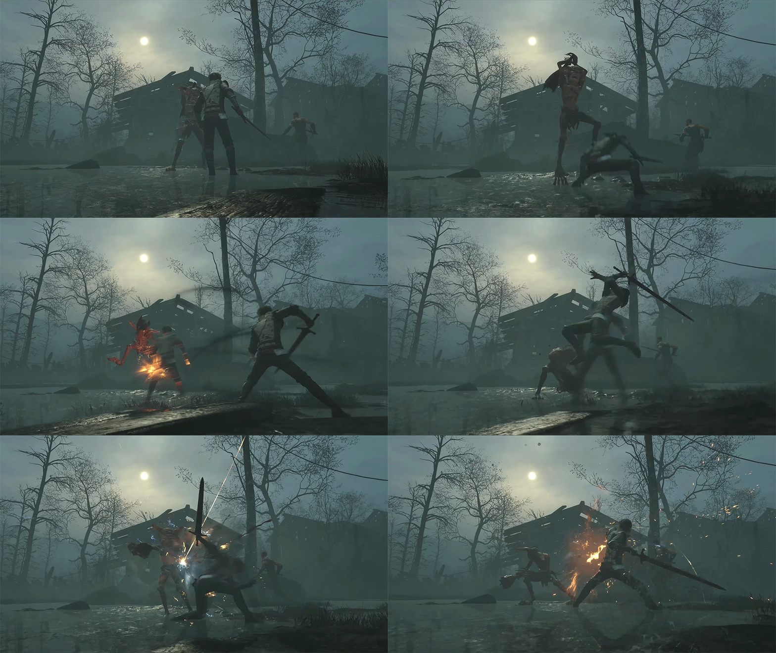

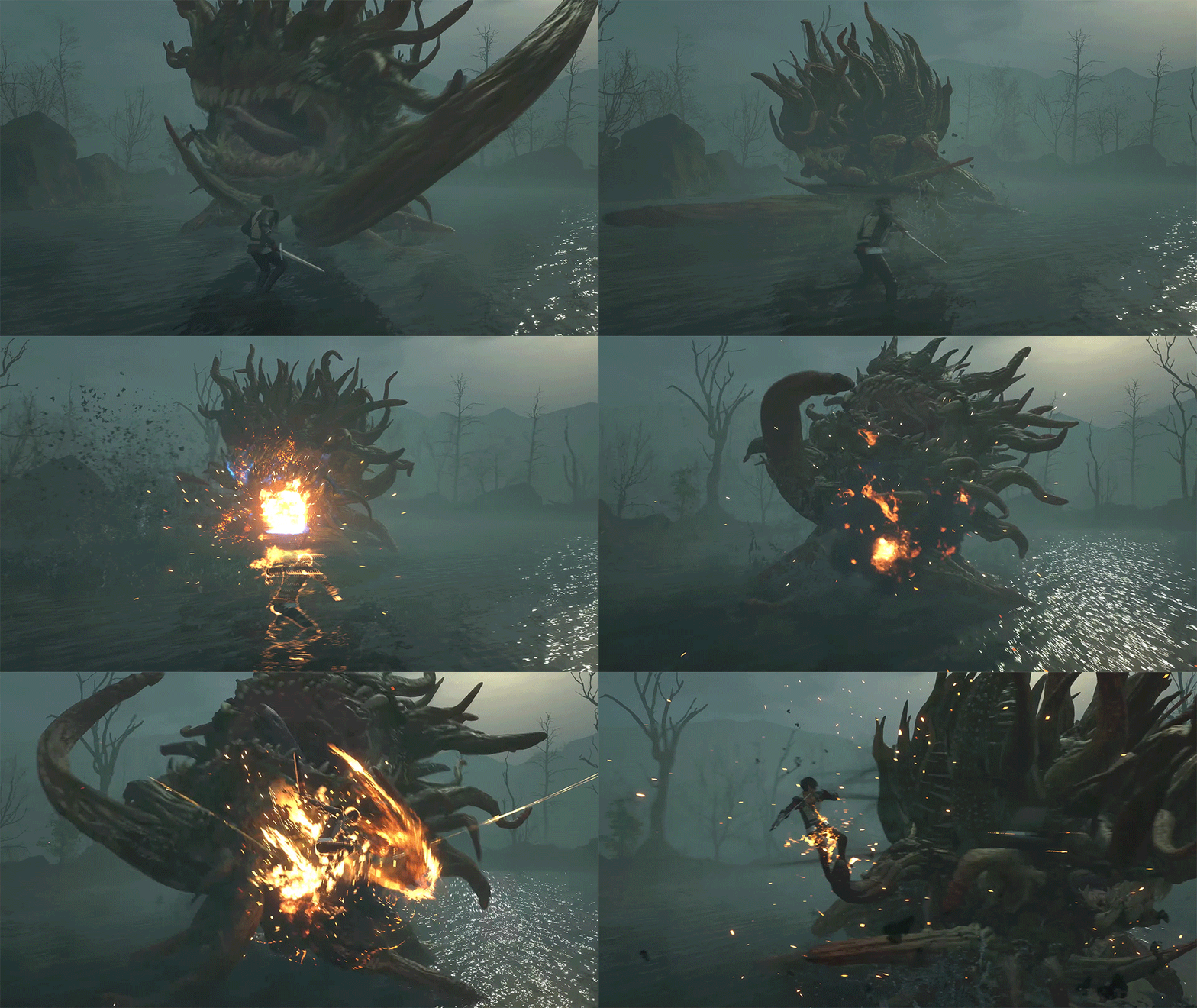
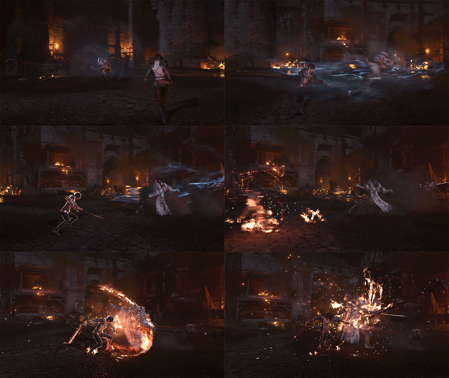


I wish we had direct feed footage for this stuff...
Likes:
Cloud_CR and Storm
Don't see why the focus on graphics should mean a detriment to everything else, like the storytelling. What do you guys tell me about games like FF7 (and FF8, FF9)? Said game pushed the graphics on the platform of its era (and so did its following successors) alingside keeping strong storytelling and else. Same thing with many western AAA games that came in the last 10-15 years that pushed graphics while being critically well received (storytelling being among their praise) like Red Dead Redemption, GTAV, The Last of Us, Uncharted 4 and so on. Pushing graphics at the detriment of other stuff is at most a correlation but, a correlation is not a causation.
While good news to have him I would still put some caution, Suzuki was only one of dozen battle designers in DMC5 (not even the lead) and while pretty good the combat of DMC5 was more flawed and less depth than the predecesor that came 10 years before.
While good news to have him I would still put some caution, Suzuki was only one of dozen battle designers in DMC5 (not even the lead) and while pretty good the combat of DMC5 was more flawed and less depth than the predecesor that came 10 years before.
This genre is expected to translate the variety of content of old-schools JRPGs into modern graphics aka multiple characters, tons of abilities, content that lasts for 60 hours, diverse locations, cutscenes... most companies aren't Rockstar which is why they have a harder time.
My two cents.
Gifs about gameplay mechanics of Final Fantasy XVI.


Seeing so much of DMC's dna in the combat makes me wonder if the ability to channel different summons in combat will be treated like the devil arms you get for beating bosses in that series. Like you keep the same sword but each summon essentially gives you a new moveset to learn and incorporate into your arsenal. It's especially interesting to think about in the context of a party where every character could potentially have multiple movesets depending on how you equip stuff. Overall I'm really excited about what this entry will have to offer in terms of gameplay.
So looking at all this the first gif is almost a one to one recreation of Nero's shuffle move from DMC so that means we already have some nice evasion/counter attack options which will require timing and skill. Second gif is just some basic juggling mechanics and I'm definitely feeling sure now that elemental magic, at least as far as fire is concerned, will be your basic fast projectile attack between melee attack combos which is analogous of Dante/Nero's pistols. Looking at the third gif now, I think I was wrong about the teleporting being taken from FFXV. It much more closely resembles Dante's air trick as it's far more instantaneous and there's no automatic attack for warping/teleporting towards an enemy from the looks of it so it's more of a positioning tool than an attack option. I'm curious if jumping off of enemies like in DMC will be a mechanic here in order to stay in the air longer in addition to the air dash that I'm seeing after that initial warp or if it will be a bit more automated/less input heavy like airstepping from FFXV which only requires tilting the analog stick while airborne and in the middle of a combo to execute. Last gif heavily reminds me of Nero's table hopper move aka your basic perfect dodge that gives you a really fast dash and good opportunity of attack for timing the evade right.
Seeing so much of DMC's dna in the combat makes me wonder if the ability to channel different summons in combat will be treated like the devil arms you get for beating bosses in that series. Like you keep the same sword but each summon essentially gives you a new moveset to learn and incorporate into your arsenal. It's especially interesting to think about in the context of a party where every character could potentially have multiple movesets depending on how you equip stuff. Overall I'm really excited about what this entry will have to offer in terms of gameplay.
Seeing so much of DMC's dna in the combat makes me wonder if the ability to channel different summons in combat will be treated like the devil arms you get for beating bosses in that series. Like you keep the same sword but each summon essentially gives you a new moveset to learn and incorporate into your arsenal. It's especially interesting to think about in the context of a party where every character could potentially have multiple movesets depending on how you equip stuff. Overall I'm really excited about what this entry will have to offer in terms of gameplay.
Likes:
CloudBuster
Really hope the MC isn't a silent protagonist, it's probably too early but the fact that he seemingly isn't named throughout the trailer whatsoever hampers a bit of my confidence at the moment
Likes:
LeonBlade and Nova
Tidas wasn't strictly a named protagonist as his name could be changed in X/X-2, but he wasn't silent by any means.
Likes:
Cloud_CR and SonOfEtro
Something curious about the trailer is that the protagonist has 3 costumes. The one at the beginning / prologue, then another after what seems like a time-skip, where he is an adult, and then another.


I noticed something else in the last gif. The insignia on the dragoon's cloak under all that blood is nearly identical to one of the two crossed tattoos on the protagonist's face in his grizzled version shown at the beginning and end of the trailer.
Last edited:
Likes:
Storm and Cloud_CR
Some of the enemies seen in the trailer and their designs for this game.
@ResetEra
-Goblin:

-Troll/Ogre (any other guesses? Maybe it's simply a Big Boy Goblin. He looks straight out of The Hobbit):

-Coeurl:

-Malboro:

-Mage (any guesses as to the type?):

-Dragoon (he's a big guy):

-Knight:

-Bonus knight (seems like an enemy, but could he be a guest? Although the face being covered tells me it's an enemy):


-Troll/Ogre (any other guesses? Maybe it's simply a Big Boy Goblin. He looks straight out of The Hobbit):

-Coeurl:

-Malboro:

-Mage (any guesses as to the type?):

-Dragoon (he's a big guy):

-Knight:

-Bonus knight (seems like an enemy, but could he be a guest? Although the face being covered tells me it's an enemy):

Likes:
Storm and CloudBuster
I prefer how Titan looks in XVI though. Also, I don't see any discernible difference in quality between XV's Titan or XVI's Titan whatsoever. I'm really not sure what you mean by your comments on XV's looking better. If you could explain in further detail, that would be appreciated.

XVI Titan has a lot of jagged edges that scream "low-poly normal mapped UE3 model" to me. The rocks in the upper left quadrant next to Titan's face are particularly egregious in this regard -- if you trace the edges of the rock, there are straight lines dozens of pixels long that are offset by light responding to fake detail in the normal map. The normal maps in question are lower resolution than the base texture, which results in a weird grainy/blurry look to the image overall.
I will admit that I'm probably overly sensitive to low-poly normal mapped UE3 models; I despised them in the PS3 era and I'm still rather allergic. But when I look at FFXVI Titan, I see the same sort of faults that I see in something like Gears of War, just an order of magnitude less eye-gouging:

(Note again the extended straight lines pretending not to be straight thanks to lighting that responds to textures rather than polygons... with the unfortunate consequence of the lighting feeling blotchy due to quarter-res normal maps. Ugh.)
Now, let's take a look at FFXV Titan:

FFXV Titan is full of all of the organic curves that XVI Titan lacks. He looks like this with completely flat lighting:

The reason why he retains all of his detail under such conditions is because practically all of his detail is polygonal -- at 400,000 poly, he's made of more triangles than Cloud from Advent Children. And when proper lighting is applied to such a model, there's no mismatch between the edges of the actual model and where the edges are supposed to be according to the normal map.
I also find that XV's lighting while impressive, also has a lot of flaws with really awkward self illumination in a lot of situations, and of course the poor AA etc. A lot of these things hamper the overall quality of XV. I think XVI looks really good right now, and I think that XVI will ultimately look a lot better than XV in the long run.
With regards to the AA, though, that might be a problem on consoles, but it's not a problem with the Windows Edition. To the extent that XVI solved the problem, I'd be shocked if the solution didn't come down to the 4k resolution. =P
It's weird though, some people say that XVI looks like a PS3 game which is baffling to me. Other people think it runs on Luminous. I don't know why the community is so split on graphics.
Likes:
Nova and Storm
Likes:
Cloud_CR and Storm
Honestly yeah XVI looks less epic/surprising by it's graphics than XV.
But...
1. The game is still in development and everything can still change like in XV
2. Graphics are not everything. I want a good storystelling and fun gameplay. And XV was for me at least the opposite.
So I'm interested how exactly the battle system will work and the story sounds also interesting and we have FINALLY BLOOD in a main FF game.
So I'm curious why 7Remake had almost no blood, perhaps XVI will be rated M??
Likes:
Somber


